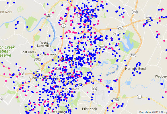
Google Maps geocoding analysis: Intake count vs. Vet count by geographical radius
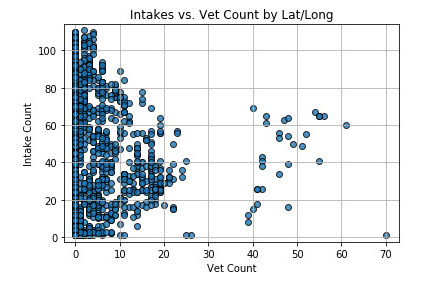
We created a scatter plot of the number of intake addresses within a 1,700 meter radius of all veterinary clinics in Austin.
Key Findings- In areas with lowest vet count, the frequency of intakes was highest.
- As vet count increased (up to a certain point), intake frequency decreased.
- In areas with a higher concentration of vet clinics, the number of intakes increased again. (This could imply a higher concentration of animals in more densely-populated areas.)
- In the area with the highest concentration of vet clinics, there was a very low intake count. (More affluent area?)
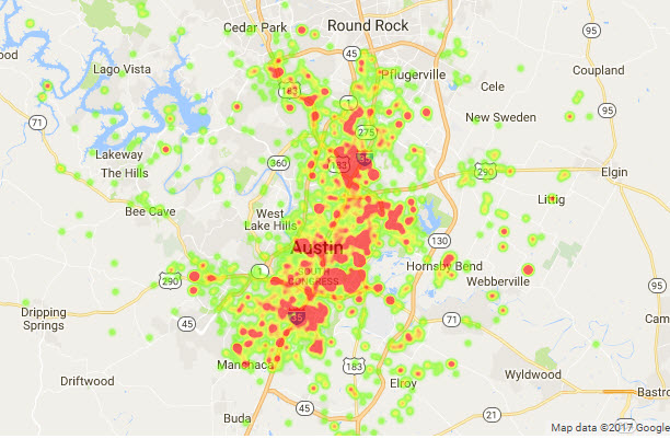
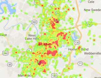
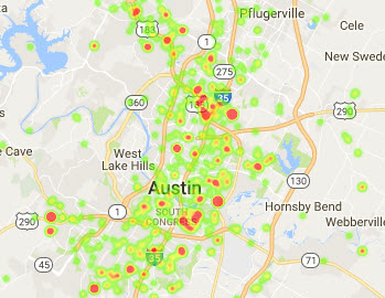
Visualizations
.jpg)